A team at the Johns Hopkins Center for Systems Science and Engineering has built a map that shows the spread of the coronavirus in near-real time.
The map is regularly updated with data from the WHO, CDC, and other sources, and illustrates how the virus is spreading in China and beyond
Lauren Gardner, a civil engineering professor and CSSE’s co-director, spearheaded the effort to launch the mapping website on Wednesday. The site displays statistics about deaths and confirmed cases of coronavirus, or 2019-nCoV, across a worldwide map that was built on Esri’s ArcGIS technology. It also allows visitors to download the data for free.
“We built this dashboard because we think it is important for the public to have an understanding of the outbreak situation as it unfolds with transparent data sources,” Ms Gardner said. “For the research community, this data will become more valuable as we continue to collect it over time.”
The statistics behind the data visualisation are being collected from the World Health Organisation, the Centres for Disease Control and Prevention, the National Health Commission of the People’s Republic of China, and Dingxiangyuan, a social networking site for health care professionals that provides real-time information on cases.
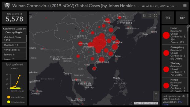
The CSSE’s Wuhan Coronavirus Global Cases website at the time of writing (29/01/2020 12.00pm AEST) reported 5,578 confirmed cases in all countries. 3,554 of these were in the Chinese province of Hubei, of which Wuhan is the capital city.
The website provides a link to a downloadable Google Sheet that contains information on confirmed and suspected cases in more than 30 Chinese locations as well as for the nations of Japan, Thailand, South Korea, Vietnam, Singapore, Colombia, Brazil, Australia, Mexico, and the United States.